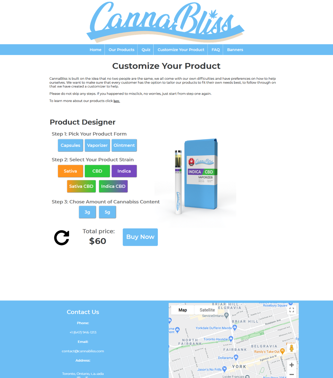
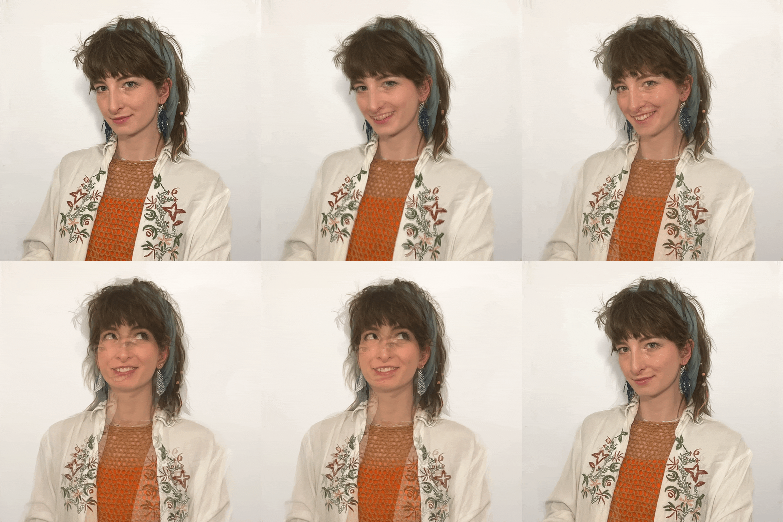
I made this website from scratch using HTML, CSS, JSON & JavaScript. The front page animation was created in Adobe AfterEffects, converted to JSON, and uses Lottie Bodymovin and JavaScript to come alive, dropping in on every index page load. It is a nod to my fervent passion in packaging and an allusion to revealing my inner workings. Have you noticed what happens when you hover over (or press on mobile) my selfie? It’ll make you smile, well at least I will be ;)
I started making this during my final semester in university, the desire to apply my learnings and share the breadth of my creative works in a format that is potential-employer friendly (contact me here ;) and representative of my personality. At the time I was reaching my 3rd year of neon green hair, asking for the choice of accent colour. As I am writing this, I haven't touched bleach in well over a year, I have a fabulous natural blonde mullet with only a bit of bleached hair in the braids I haven't trimmed since my initial mullet cut.
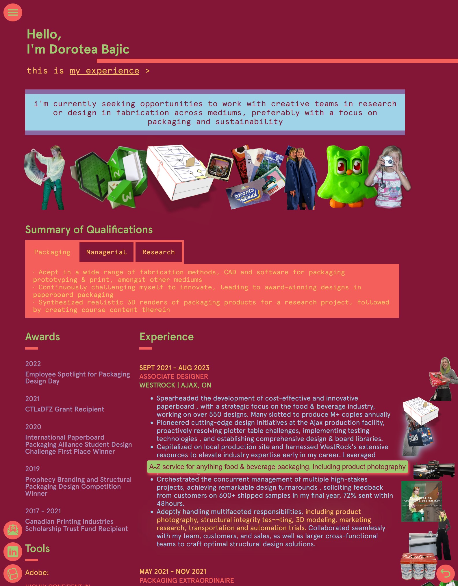
Initially I had two colour schemes, a switch made easy by changing the linked CSS file, intending for the second to use a similar palette while being more accessible to read. You can check out my original index page here if you're curious to see where we started from. I stopped working on this website the moment my last employer sent me their second offer. This version doesn't just have more themes, each with a corresponding special front page smile and meets contrast standards for accessibility. This whole site will eventually meet other standards for accessibility - such as alt texts on every image, captions & transcripts for videos, tab-able buttons and even additional languages. I learned a few of those before trying coding languages.
Having a perfect website isn't my priority, not even a fast loading one. I know im not going to have that much traffic and I hope visitors are patient enough for all my flash to load. Besides, I think the flicker of unformatted pages adds character when you change from the default the colour theme. Also if you scroll too fast on my project pages, it's going to get messy. These characteristics come from the raw nature of its development, using minimal tools to focus on learning about the core of website development. In recent months however I started using a tool which changed my game, ChatGBT.
While AI is no perfect tool, it was massively useful in configuring new features and patching other problems, mostly since I got near-immediate responses on questions specific to my code. Since I lack a formal extended education on programming, and when in passion I prefer to learn by exploring over lectures. ChatGBT has been extremely helpful and I’ve learned plenty on how to best inquire such intelligence.
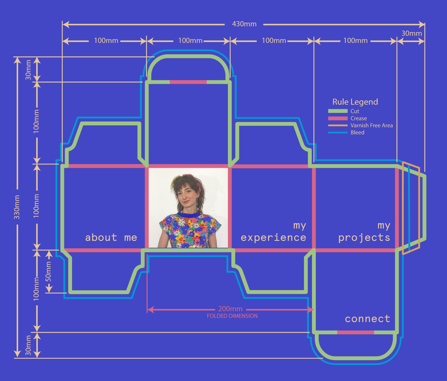
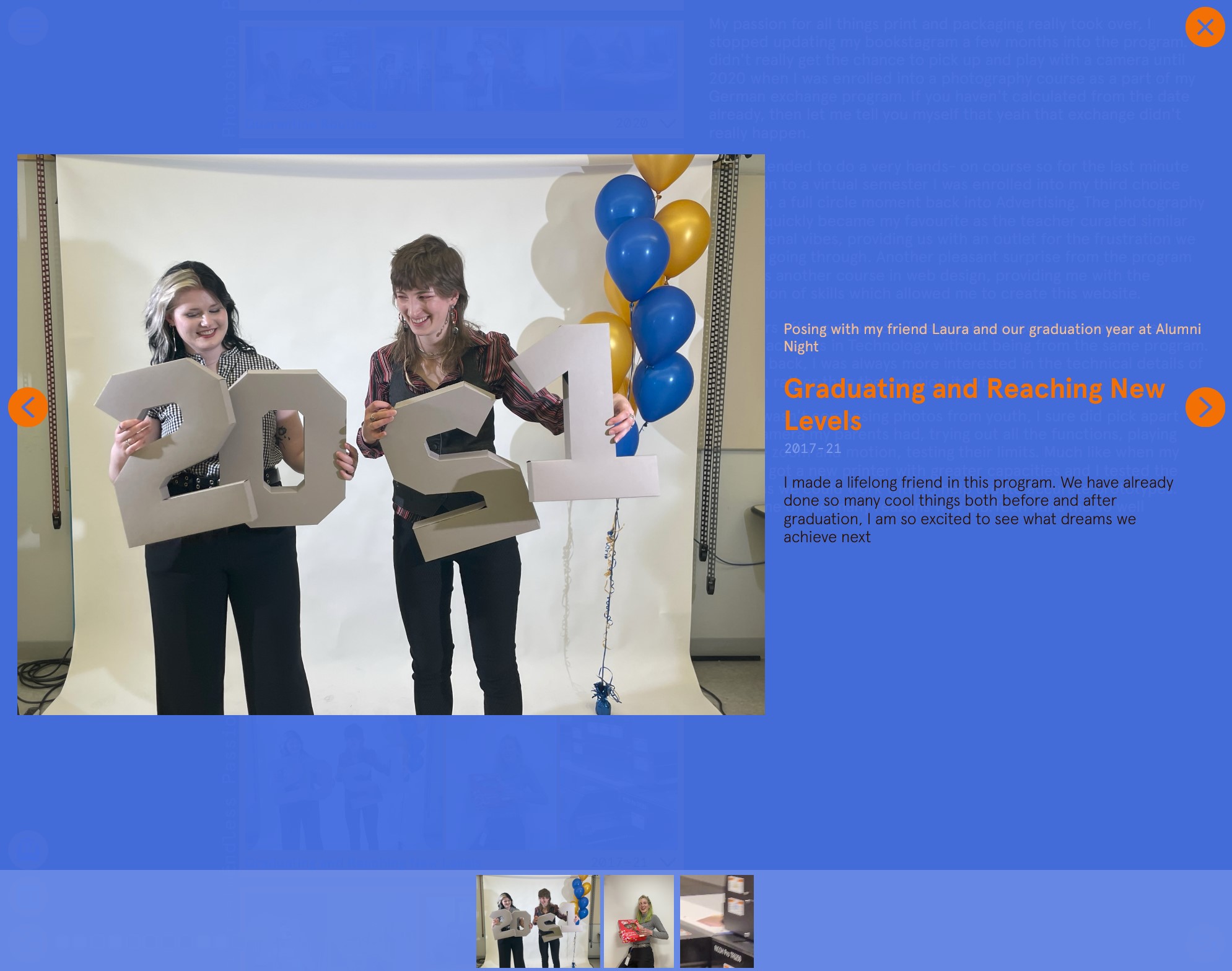
My goal while building this was to pique your curiosity with interactive elements designed to draw your attention. The cube in the bottom left spins as you scroll and if you click on it you have the option to toggle colour themes. Short descriptions appear under your mouse when you hover on images on my About Me and My Experience pages, and often hovering on text will highlight its associated media. On most pages when you click on the images, a slideshow of that selection will pop up. When you resize your window after opening the production dieline easter egg on the index page, the measurements will change accordingly. To extend beyond, there are hyperlinks to other places within my website and out wider in the web. I also welcome you to use my easy email template on my contact page to share this page with others, or download a resume which will soon match the colour theme you are currently viewing the site in.
All throughout there are so many details in this quilt, and not all of them were as fun to make. I wish it was as brief as this sentence about how much trouble the scroll behaviors on my project pages caused me, but we persevere and the end result is pretty cool. I enjoyed referring back to Version 1 as I worked on the update, just to see how much I was growing.
I'll grow until the crows come home. There are so many other features I look forward to adding, but in my excitement for sharing this with you, they'll have to wait for Version 3.
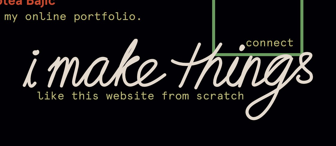
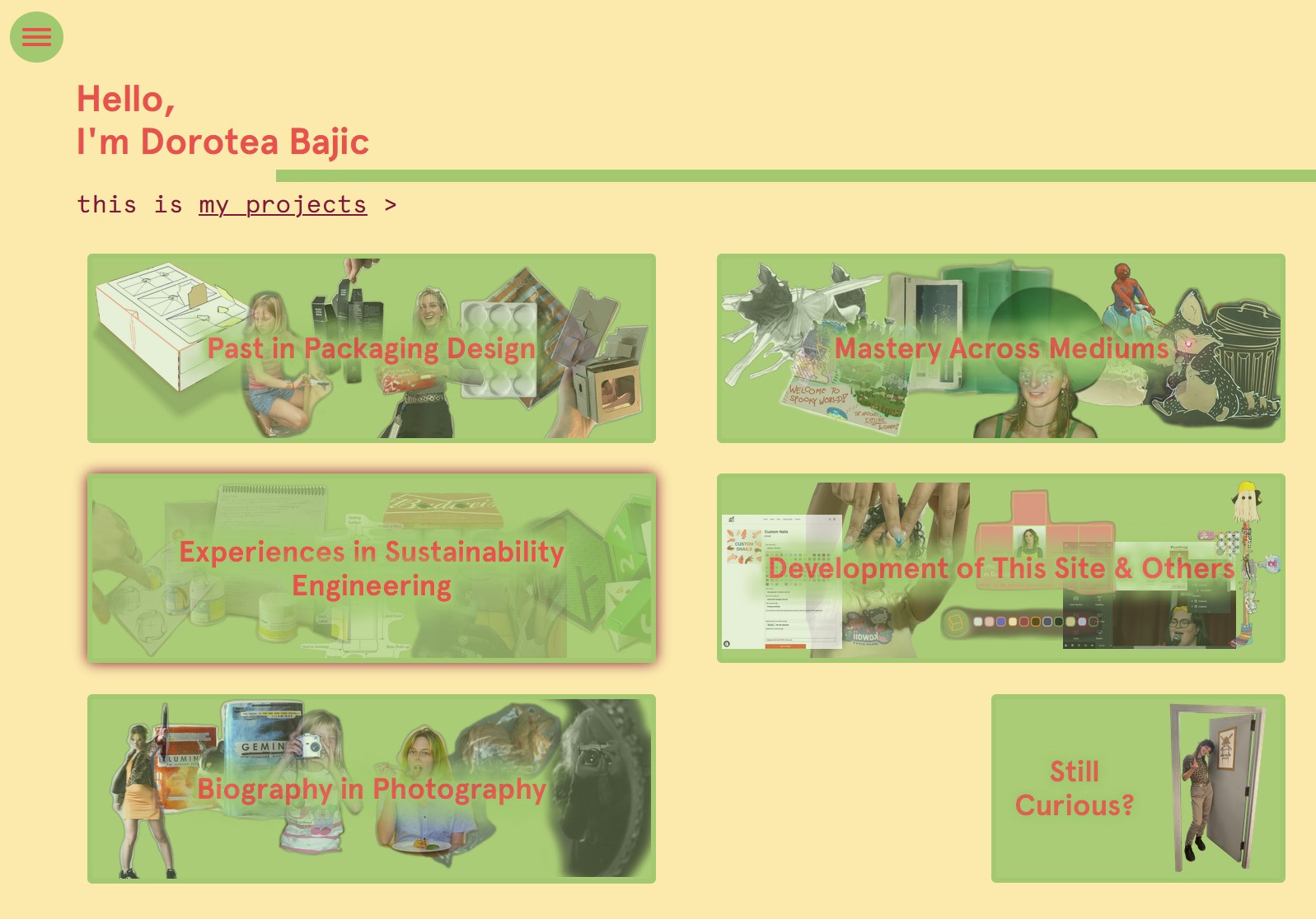


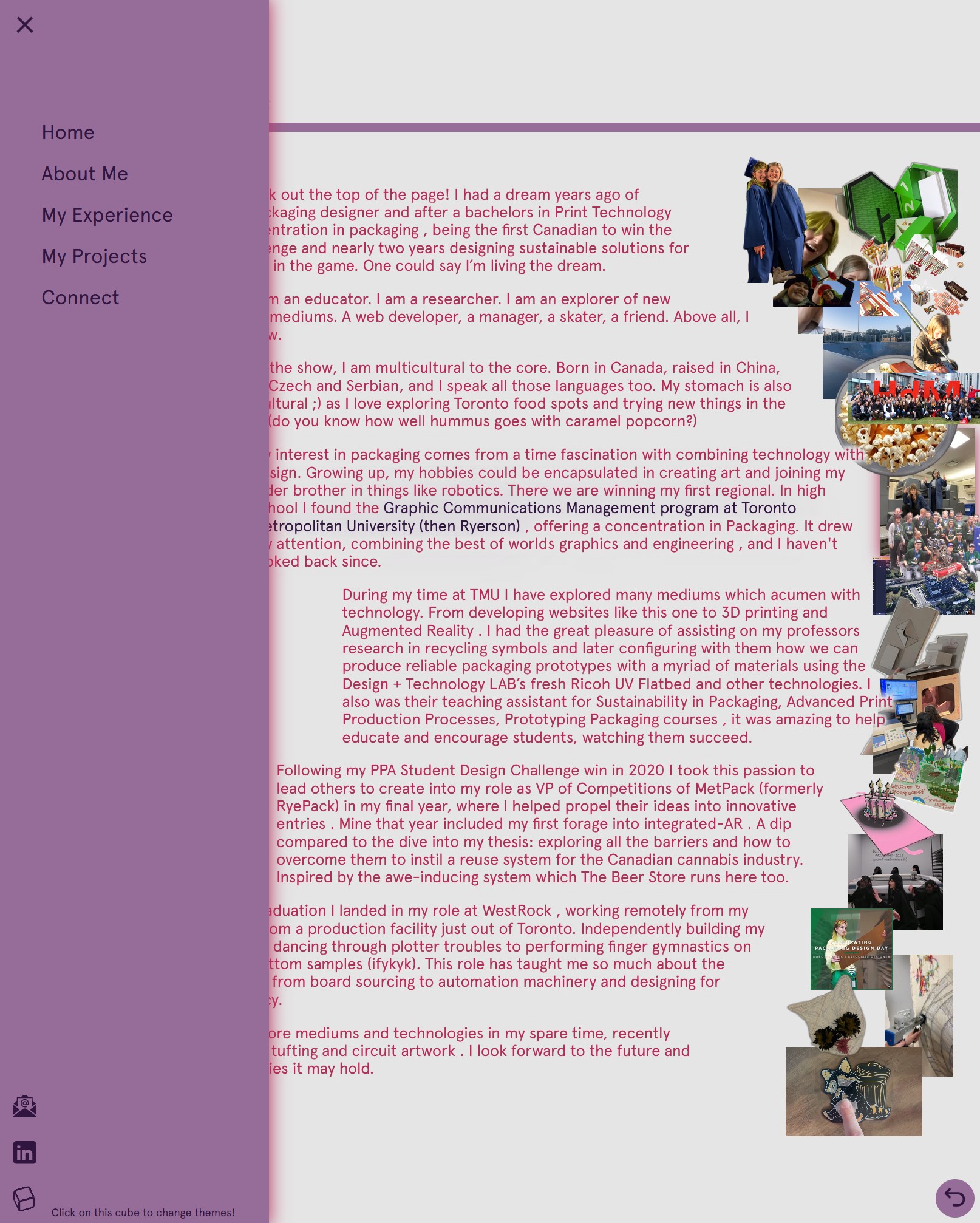
Dorotea.ca Today
2024
After leaving my last full-time job, I dove into re-building my personal website so that it would more accurately capture my current skill level and enhance the experience overall with even more colour themes and special features such as the responsive production box on my home page or deeper details when clicking on a project image or hovering around my resume page. No templates or builders, just raw code for everything you see.
HTML - JavaScript - CSS - AfterEffects
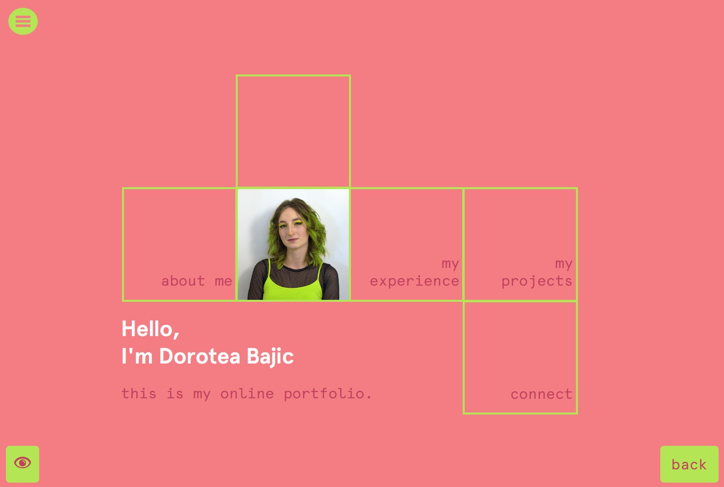

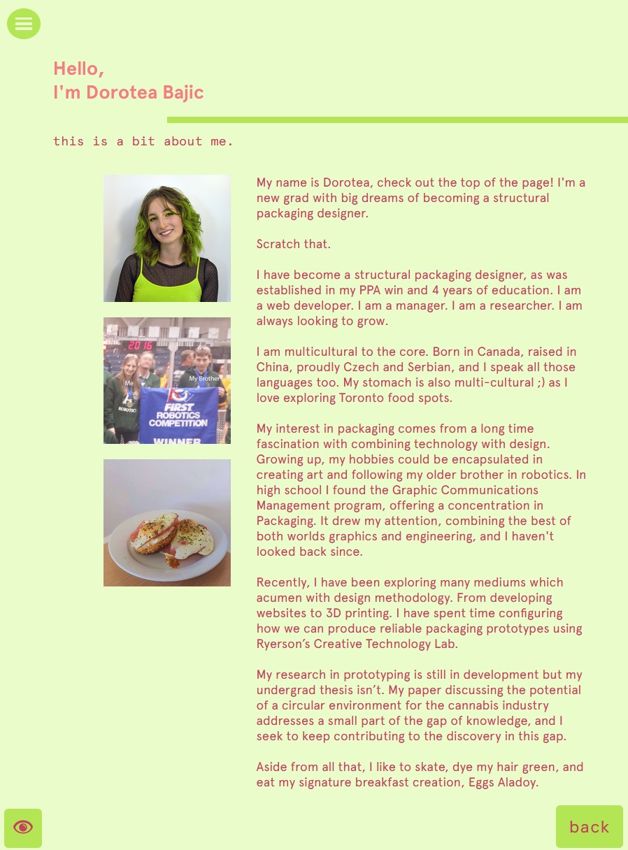

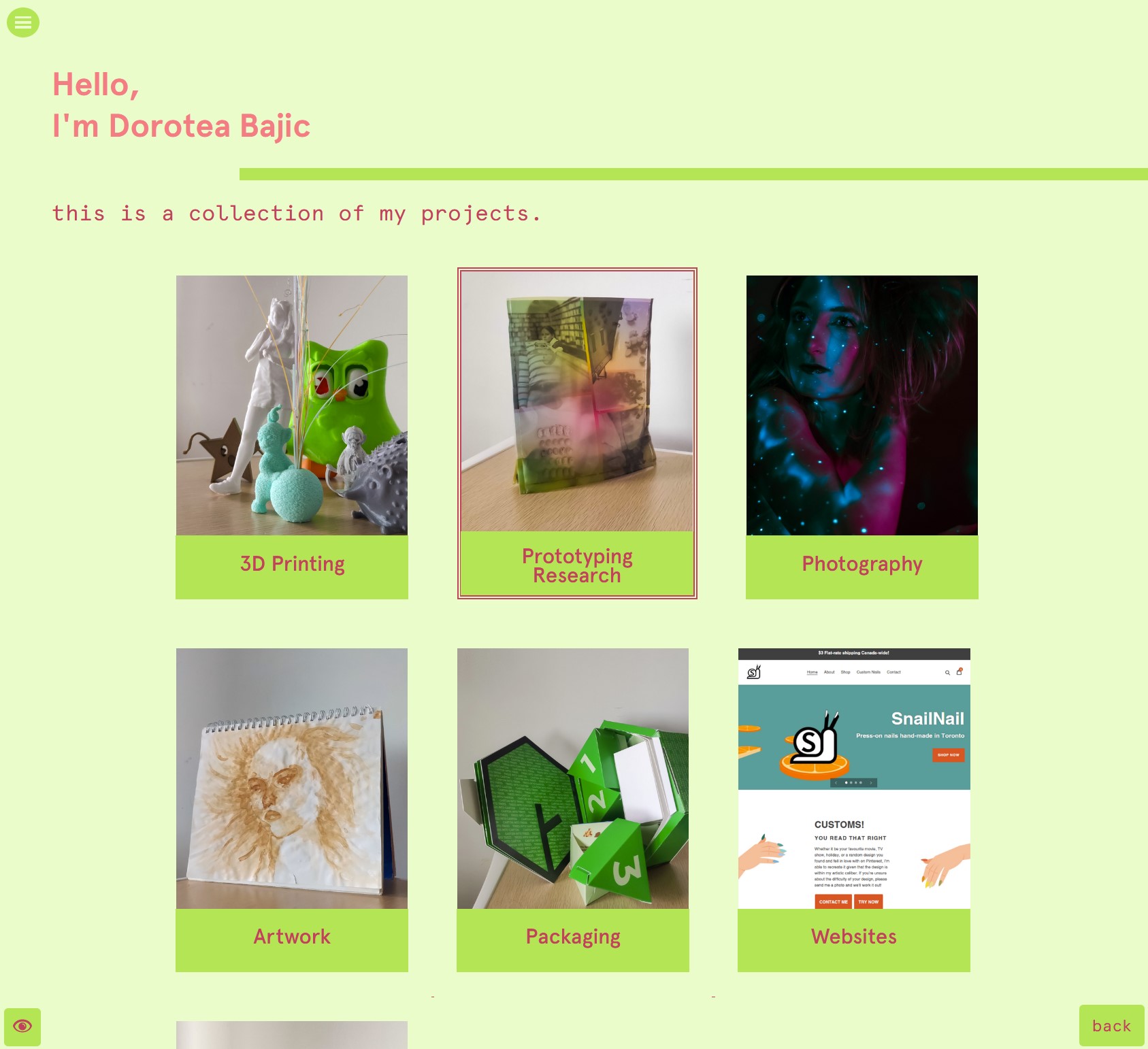
Version 1 of Dorotea.ca
2020
After being introduced to web development during my German exchange, I decided to push my skills by building a personal website to share my projects and experience with the world. I was committed to not use any website builder such as DreamWeaver or Wix, meaning I had to write the code from scratch for every aspect. Full of undesired effects from my unpolished code (we're all beginners when we start), an update was sorely needed to properly represent myself.
